Dalagan — From a Strava Sync Script to a Coaching Platform
I built Splitlog to stop copy-pasting my Strava stats into Notion. Then I sat down to actually design it — every page, the information architecture, the brand — and realized the app I'd built and the app runners actually needed were two different things. This is the story of that rebuild.
THE BACKSTORY
I built the first version — Splitlog — because I was tired of a five-minute ritual after every run: open Strava, read off the stats, open Notion, retype everything into a training log. So I automated it. Strava OAuth, webhooks, a dashboard, a training plan table, four analytics charts. First full-stack project, first time with Next.js and Supabase, first real OAuth integration. It worked. The moment a run synced automatically without me touching anything — that's when full-stack development clicked for me.
But "it works" and "it's designed" are different bars.
Splitlog was a spreadsheet with a login screen. Every page was a table or a form. The dashboard was a run log with four stat cards bolted on top. There was no sense of where you were in training, no coaching, no product thinking beyond "surface the data." It solved my original problem — manual data entry — and stopped there.
So I went back through the entire app, page by page, and rebuilt it as a real product.
THE REBUILD
I didn't touch code first. I went through every page and asked the same question each time: what is this page's actual job, and does its current design do that job? Usually the answer was no.
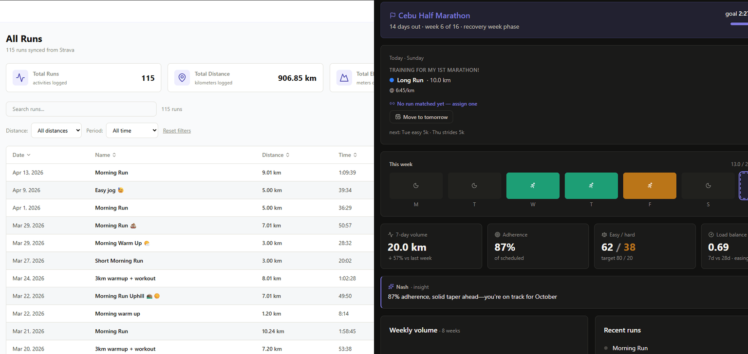 The dashboard wasn't a dashboard. It was the run table with stat cards on top — total runs, total distance, total elevation, numbers that don't change what you do today. I split it in two: a
 /runs page that's the real archive (grouped by week, filterable, sortable), and a dashboard that answers "what do I do right now" — today's scheduled workout, this week's progress, training load, one specific coaching observation instead of four vanity metrics.
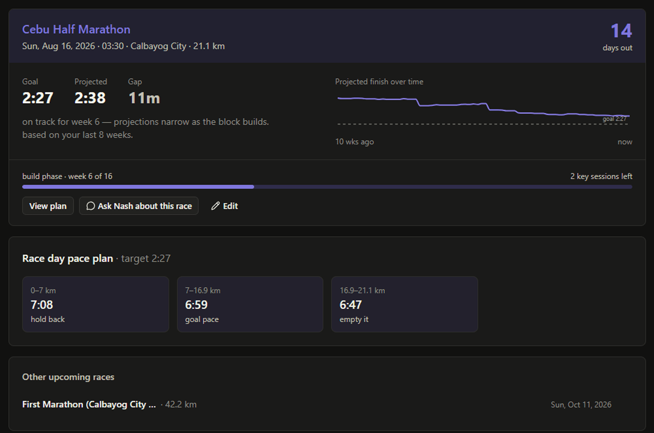 There was no concept of a race. Everything in a runner's training points at a goal, and the original app had nowhere to put one. I designed a
 /races page around a single idea: the next race is the whole point, so it gets hero treatment — a countdown, a projected finish time plotted against the goal over time, a generated race-day pace strategy. Training plans, which used to be freestanding objects, now belong to a race.
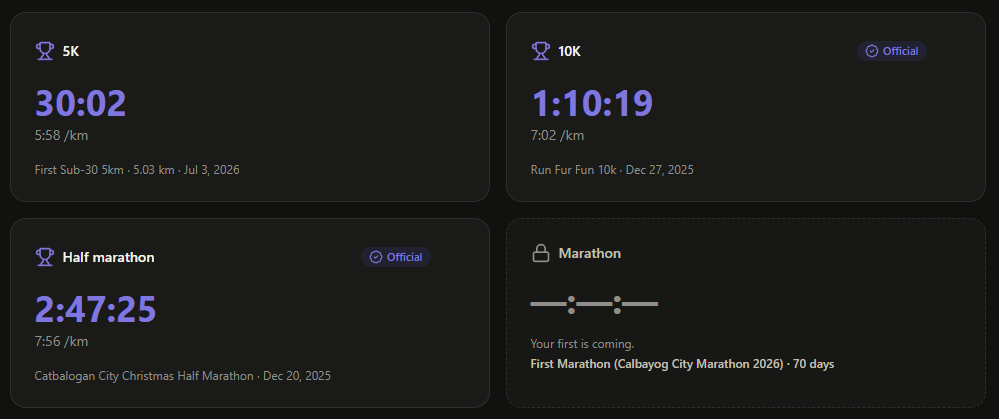 Personal bests were buried in a chart tab. I pulled them into their own
 /records page — official race PRs separated from best efforts, a locked/aspirational card for every distance you haven't raced yet ("Your first marathon is coming — Cebu Marathon, 97 days"), and a shareable card, since a PR is the one thing in a running app people actually want to post.
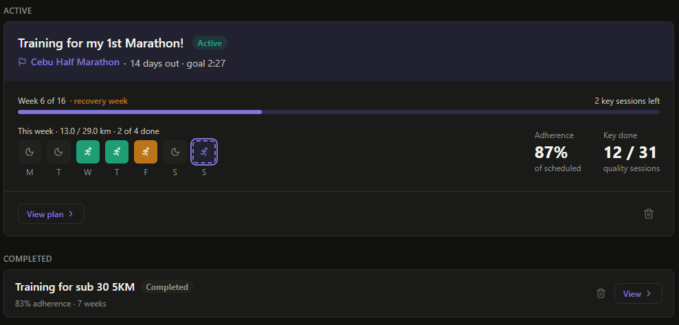 Training plans were a flat table of 64 rows. I redesigned the plan detail view around weeks instead of days — collapsible week groups, phase labels (build/cutback/taper), the current week expanded by default instead of day one of a plan that started three months ago.
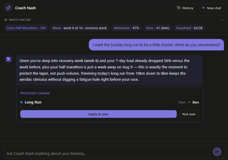 The AI coach — the actual reason to pick this app over a spreadsheet — had no idea what plan you were on. I rebuilt Coach Nash around a single context object assembled from your real training data (active plan, goal race, adherence, recent runs, PRs), had it generate one specific insight on sync instead of a chat box waiting to be prompted, and gave it the ability to propose concrete plan edits — move a workout, adjust a distance — that you approve with one click rather than a wall of text you have to interpret yourself.
 A consistent design system replaced ad-hoc styling. One color meant one thing across every page: a five-step intensity ramp (recovery → easy → steady → threshold → VO2) used identically on the runs table, the week strips, the plan calendar, and the coach's proposal cards. Purple — the brand color — became reserved for exactly two moments: race day and a broken record. Everywhere else, it's neutral.
 Then I rebuilt the brand around what the app actually became. "Splitlog" described a logging tool; the product had turned into a coaching platform. I renamed it Dalagan — Hiligaynon for to run — designed a new mark (a route curve arriving at a destination, echoing the idea that every training block points somewhere), and rewrote the positioning from "personal run management" to what the app is actually for: getting a runner from today's session to race day.
THE TECHNICAL DEEP DIVE
The redesign wasn't just visual — a lot of it forced real architectural decisions. Onboarding is the clearest example of how a "just add a setup flow" task turned into a structural fix.
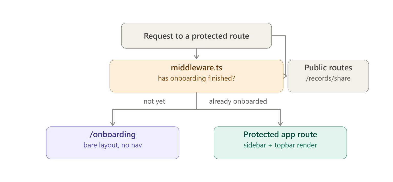
1. Onboarding had to move out of the app entirely
The original onboarding page lived inside the main app's route group, which meant the sidebar and topbar rendered around the setup wizard — a runner who hadn't configured anything yet could navigate straight into an unconfigured app mid-flow. I moved it to its own route group with a bare layout (no nav, just the wizard) and made a Next.js middleware the single gate: any protected route, for a logged-in user who hasn't finished onboarding, redirects to /onboarding before the app shell ever renders. One redirect mechanism, checked on every protected request — not scattered across individual page components.
// middleware.ts — the only onboarding/auth redirect in the app
const isProtectedRoute =
  pathname.startsWith("/dashboard") || pathname.startsWith("/plans") ||
  pathname.startsWith("/coach")     || pathname.startsWith("/races")  ||
  pathname.startsWith("/records")   || pathname.startsWith("/gear")   || /* … */;

// logged in + protected route + !dismissed_onboarding → /onboarding
One route needed a carve-out even though its prefix is technically protected: the public PR share-card image has to render with no session at all, since it's what a stranger sees when someone shares a link. That edge case — "protected route with one public sub-route" — is the kind of thing you only find by actually building the gate, not by designing it on paper.
2. The rebuild replaced content, but the real work was extracting shared components
Three fields the new onboarding needed — experience level, run-day selection, race distance — already existed elsewhere in the app, but as inline, non-reusable code: a native <select> buried in the Settings page, chip JSX duplicated in the same file, a ~45-line distance picker hardcoded inside the race form. None of it was a component you could just import.
Rather than write a second copy for onboarding, I pulled all three out into real shared components (ExperienceLevelField, RunDaysField, RaceDistancePicker) and rewired the original pages onto them. One visible side effect: Settings' experience-level control changed from a dropdown to chips, purely as a consequence of making the field reusable — a small UI change that came from an architecture decision, not the other way around.
3. A real bug, found by dogfooding a generated plan
Testing a plan built through onboarding, I noticed Tempo and Interval sessions occasionally landed on days I hadn't marked as run days. The Long Run was pinned to an exact calendar date in the generation prompt — safe — but the rest of the week was only described to Claude as repeating prompt text, with nothing validating the output against the runner's actual selected days.
The fix, enforceRunDayPlacement(), runs after every plan generation (shared by onboarding, the Races "build a plan" flow, and the Plans page's AI generator) and swaps content between any workout that landed on an unselected day and whichever selected day was sitting empty as rest — nothing invented, just relocated to where the runner actually said they'd run. It's a good example of why I always tested generated output against real constraints instead of trusting that a well-written prompt was sufficient on its own.
4. Reusing generation logic instead of forking it for a "no race" path
Onboarding offers three goals: a specific race, a distance goal, or "just staying consistent." The plan-generation endpoint only understands race-shaped requests — a distance, a start date, and an end date. Rather than add a second code path for the consistency case, I pass it a distance label the pace calculator doesn't recognize, which makes the same endpoint fall into its existing effort-based branch instead of a paced one — exactly the right output for base training, with zero new server-side logic.
WHAT I LEARNED
Redesigning is a different skill from building. Splitlog v1 taught me how to wire up an OAuth flow and a webhook pipeline. This rebuild taught me to ask what a page is for before touching its layout — and to notice when two pages were quietly doing the same job (a training-load number on both the dashboard and a plan page, computed two different ways) before that inconsistency became a bug report.
Reuse is a design decision, not just a refactor. Every shared component in this rebuild — the distance picker, the day-of-week chips, the plan-generation endpoint itself — started as "onboarding needs this too" and became "so now there's one version instead of two." That discipline is what keeps a fast-moving redesign from quietly forking into inconsistent copies of the same feature.
A good product decision usually shows up as an architecture decision. Deciding the dashboard's job was "what do I do right now" meant precomputing insights on sync instead of generating them on every page load — a performance and cost decision that fell directly out of a UX decision.
Write down what you didn't finish. Every feature in this rebuild has a documented list of known gaps — onboarding has no draft persistence, the file-upload step is a visual stub waiting on a real importer, custom race distances lose their computed training paces. Writing those down explicitly, instead of letting them hide as undocumented behavior, is what made this codebase something I could actually hand off or pick back up months later.
THE RESULTS
Before this rebuild: a run tracker with a login screen — one dashboard page trying to be an archive, a stat summary, and a coaching surface at once, and an AI feature that couldn't see your training.
After: eight purpose-built pages, each answering one question — Dashboard (what now), Runs (what happened), Races (what am I working toward), Plans (what's the block), Records (what have I earned), Gear (what am I running in), Coach Nash (what should change) — plus a rebrand that matches what the product actually does.
Product & design
- Redesigned every core page from first principles, with a consistent color and typography system applied across all of it
- Designed and shipped a full rebrand — name, logo, wordmark, color palette, tone of voice
- Rebuilt the AI coach around real training context instead of a stateless chat box
- Rebuilt onboarding as a focused, gated pre-app flow instead of a tour rendered inside the live product
Engineering
- Extracted three previously-inline UI patterns into genuinely shared components, with the original pages refactored onto them rather than forked
- Built a single middleware-based gate governing every protected route and the one onboarding flow
- Found and fixed a real plan-generation bug through dogfoating a generated plan against actual constraints
- Kept the data model honest — new features reused existing tables and endpoints wherever the shape already fit, instead of growing a new one for every page
//RaceFormSheet Component
<RaceDistancePicker seedDistanceM={seedDistanceM} seedKey={formKey}
onChange={setDistanceM}/>

//StepGoal Component
<RaceDistancePicker onChange={(m) => onChange({ distanceM: m })} />
TECH STACK
Frontend: Next.js (App Router), TypeScript Styling: Tailwind CSS, a custom design-token system (color, spacing, typography) Data Fetching: TanStack Query Database: Supabase (PostgreSQL, Row Level Security) Auth & Gating: Supabase Auth + Next.js middleware AI: Anthropic Claude API — training plan generation and Coach Nash Charts: Recharts Deployment: Vercel
WHAT'S NEXT
A real intake layer. Run data currently comes from Strava's API; the plan is to decouple from any single source — file upload (.gpx/.fit) as the universal fallback, then direct integrations with watch platforms, so the product isn't dependent on one company's API.
A native mobile app with its own run recorder. The web app becomes the "review and manage" surface; a mobile app — the primary platform going forward — adds in-app GPS recording, so a runner never has to leave Dalagan to log a workout.
Coach Nash, fully wired. The context-aware version described above is built; extending it to propose full week rebuilds (not just single-workout moves) is the next step, once there's real usage data to validate the smaller edits first.
THE BIGGER PICTURE
Splitlog solved a real annoyance — I stopped retyping my own run data. But it was still a project built the way I knew how to build at the time: get the integration working, wire up a table, ship it.
This rebuild was different. Almost nothing about the underlying stack changed — same database, same auth, same core sync logic. What changed was that I stopped treating design as decoration on top of working code, and started treating it as the thing that decides what the code should even do. A page's layout, a color's meaning, an onboarding flow's placement in the route tree — all of it turned out to be product decisions with real technical consequences, not cosmetic ones.
That's the actual lesson from this version: building the feature is the easy half. Deciding what the feature is for is the part that took the redesign to learn.
Enterprise CRM Platform for Advertising Sales
Mission-critical platform serving 15+ sales team members. Built complex dashboards, filtering systems, and PDF generation. My biggest technical challenge: delivering enterprise features under tight deadlines.
Dynamic Content Page Builder
15+ reusable components giving writers creative freedom. Reduced content creation time by 50% and eliminated developer dependencies. Built with Vue 3 & Nuxt 3 component architecture and Pinia state management.